If You Go Down To The Museum Today...
continued
It was Industrial Facility that for me, as a product designer, answered the question ‘what is design?’ the best. In a world of excess and celebrity, Industrial Facility’s brilliant work is a shining light; an intelligently simple and perfectly practical light that I hope young and old designers alike benefited from seeing as a collection of work.
Their work comes alive through use; it is the embodiment of everyday, what mass produced design should be. But, I have to say, I was disappointed; why couldn’t I touch? I understand why a kitchen knife needs to be behind glass, but why a toy that I can buy at Muji? How do you understand how brilliant a hard drive is without being in the position of needing to buy one?
When I asked Sam Hecht of Industrial Facility about the exhibition, he had answers for me. The display cabinets used were restricted by the Museums resources and having showed me images of exhibits from the 1950s, where precious products were shown in defined space but not behind glass, we both bemoaned the fact that this just doesn’t seem possible today. A five month exhibition, with school groups and adults alike who feel it is appropriate to grope at anything not behind toughened glass, just would not last without closed cabinets.
The Industrial Facility exhibition showed simple products with simple lighting and simple stories. Perhaps the problem was the Museum and what we expect from a design museum rather than an art gallery. We know not to touch art. But we expect more from design, and design curation so often comes with layers of interactivity. Hecht reminded me of the brilliant exhibition of Herzog & de Meuron’s work in the turbine hall at the Tate modern, where models were presented in space and light and left to tell their own tales – offering a sharp contrast to the Design Museum’s dense and moody Richard Roger’s exhibition.
Where design curation adds so much to Walker’s photographs, it can so easily take away from exhibitions of more traditional design. It is to do with confidence; art galleries give works space to speak for themselves. However, design curation seems to lack the assurance to put out a piece of everyday design and simply say: this is design.
So back to the Design Museum, and the difficulty is that it’s not a gallery. A museum is expected to ‘safeguard and make accessible’, and here lies the problem; how do you meet both these expectations with, for instance, a chair? To make the chair accessible you let people sit on it, but to safeguard it you put it in a glass cabinet, or in the case of ‘chair alley’ into storage.
I don’t know the answer to this problem, all I know is that a beautiful kettle looks better on the stove than it does on the shelf.
You can see Freddie’s installation ‘Benchmarking’ in the Design Museum Tank until the 2nd November 2008
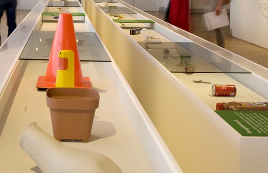
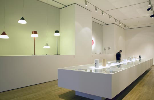
Industrial Facility at the Design Museum
Photo credit: Luke Hayes
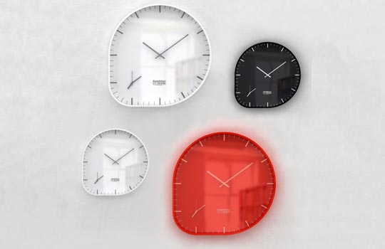
Design Museum: Two Timer, designed by Industrial Facility for Established & Sons
Photo credit: Industrial Facility
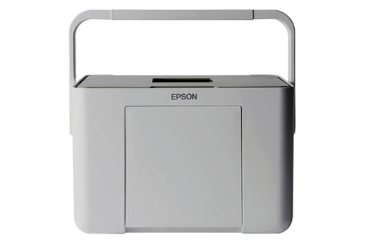
Design Museum: Picturemate Printer, designed by Industrial Facility for Epson
Photo credit: Epson Japan


