'Beyond Modernism' works by Wim Crouwel at Galerie VIVID
28 October - 9 December ‘18
In 2002 Galerie VIVID presented 'Letters van Crouwel' an exhibition about the fonts Wim Crouwel designed. Again in 2008 VIVID organized an exhibition about the posters Wim Crouwel designed.
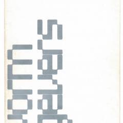
Galerie VIVID is proud to present for the third time the work of Wim Crouwel in the exhibition 'Beyond Modernism'. This time the focus will be the catalogues he designed.
Wim Crouwel (b.1928, Groningen, the Netherlands) was inspired by the founders of modernism and developed unique typographic designs based on their principles.
Crouwel studied fine art at the Minerva Academy in Groningen before moving in the early 1950s to Amsterdam, where he initially worked for an exhibition design company. He was very interested in architecture and developed a strong sense of spatial awareness. Soon this led to commissions for cultural institutions such as the Van Abbemuseum in Eindhoven. When Edy de Wilde, director of the Van Abbemuseum, became director of the Stedelijk Museum in 1963, he took Wim Crouwel with him. Until the end of De Wilde’s directorship in 1985, Crouwel was solely responsible for the Stedelijk’s identity and for almost all posters and catalogues. While at the Stedelijk, Crouwel developed a unique grid system that acted as a template for the museum’s graphic identity, which created visual consistency for the museum.
Embracing the modernity in the 1960s, with the dawn of the space age and computer technology in mind, Crouwel designed the radical New Alphabet typeface in 1967, specially made for the computerized typesetting and composing machine. The New Alphabet appeared almost alien, a cipher script of vertical and horizontal lines. This illegible font challenged the design establishment and provoked debate, which Crouwel was happy to engage in, having openly admitted to placing aesthetics above function. The New Alphabet was reused by Brett Wickens and Peter Saville for the Joy Division album Substance in the late 1980s and then digitized and made available for use in 1997 by The Foundry. Crouwel designed a number of other fonts, including Gridnik, whose title refers to his use of grid systems, which also resulted in the endearing nickname Mr. Gridnik.
In 1963 Crouwel co-founded the multi-disciplinary design agency Total Design, creating the identity for numerous Dutch companies. In the 1970s he was part of a team of four designers who designed the Dutch Pavilion for the Osaka World Fair. Crouwel also designed numerous postage stamps for the Dutch post office and did a controversial redesign of the telephone book in the Netherlands, using only lowercase letters and placing the telephone number before the name.


