Maggie's Cancer Centre Manchester by Foster + Partners
Interior Architecture and Design
Located across Britain and abroad, Maggie’s Centres are conceived to provide a welcoming ‘home away from home’ – a place of refuge where people affected by cancer can find emotional and practical support. Inspired by the blueprint for a new type of care set out by Maggie Keswick Jencks, they place great value upon the power of architecture to lift the spirits and help in the process of therapy. The design of the Manchester centre aims to establish a domestic atmosphere in a garden setting and, appropriately, is first glimpsed at the end of a tree-lined street, a short walk from The Christie Hospital and its leading oncology unit.
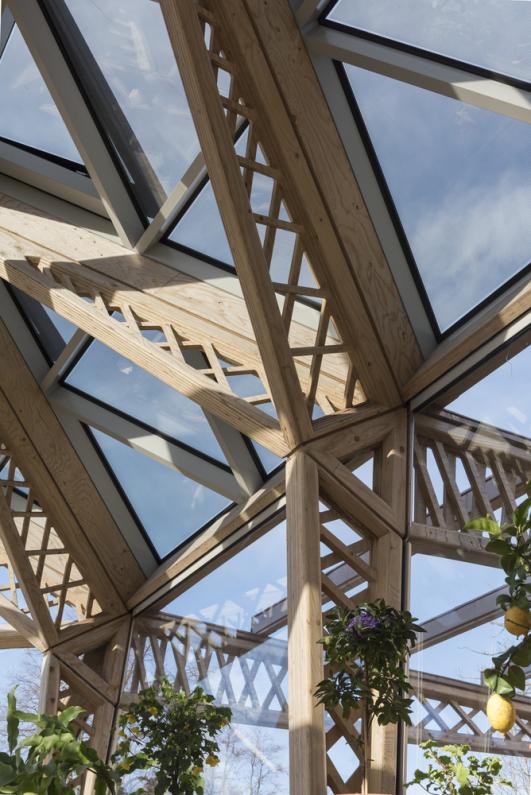
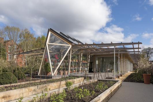
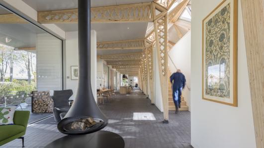
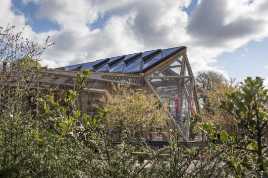
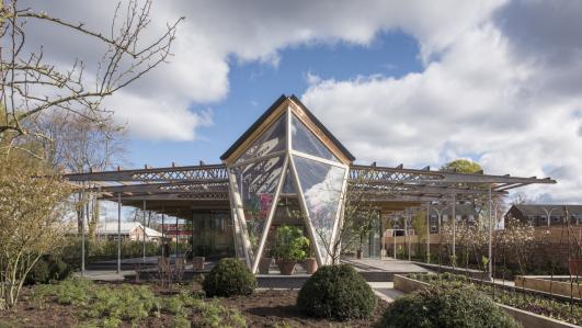
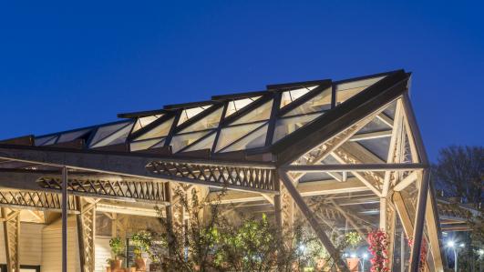
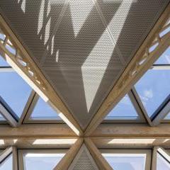
The building occupies a sunny site and is arranged over a single storey, keeping its profile low and reflecting the residential scale of the surrounding streets. The roof rises in the centre to create a mezzanine level, naturally illuminated by triangular roof lights and it is supported by lightweight timber lattice beams. The beams act as natural partitions between different internal areas, visually dissolving the architecture into the surrounding gardens. The centre combines a variety of spaces, from intimate private niches to a library, exercise rooms and places to gather and share a cup of tea. The heart of the building is the kitchen, which is centred on a large, communal table. Institutional references, such as corridors and hospital signs have been banished in favour of home-like spaces. To that end the materials palette combines warm, natural wood and tactile surfaces. Staff will be unobtrusive, yet close and accessible. Support offices are placed on a mezzanine level positioned on top of a wide central spine, with toilets and storage spaces below, maintaining natural visual connections across the building.
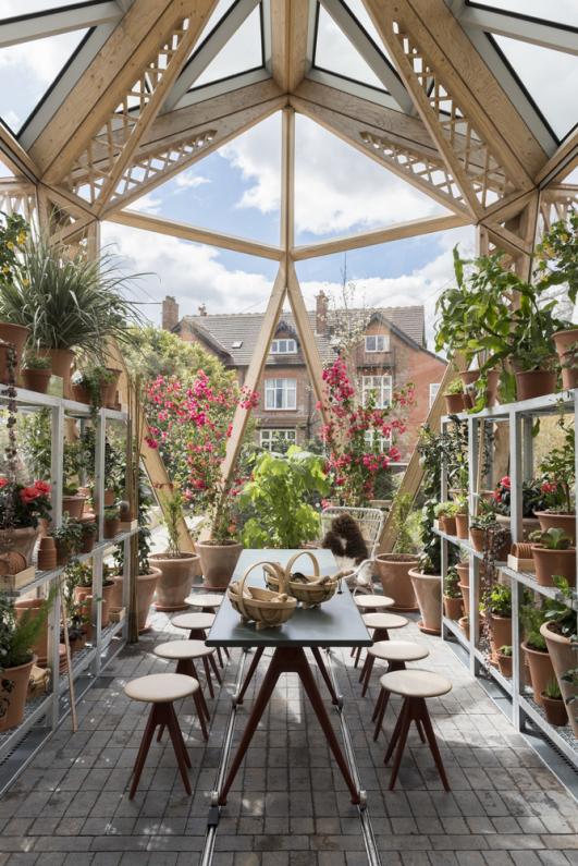
Throughout the centre, there is a focus on natural light, greenery and garden views. The rectilinear plan is punctuated by landscaped courtyards and the entire western elevation extends into a wide veranda, which is sheltered from the rain by the deep overhang of the roof. Sliding glass doors open the building up to a garden setting created by Dan Pearson Studio. Each treatment and counselling room on the eastern façade faces its own private garden. The south end of the building, extends to embrace a greenhouse – a celebration of light and nature – which provides a garden retreat, a space for people to gather, to work with their hands and enjoy the therapeutic qualities of nature and the outdoors. It will be a space to grow flowers and other produce that can be used at the centre giving the patients a sense of purpose at a time when they may feel at their most vulnerable.
The centre, designed and engineered by Foster + Partners, also features bespoke furniture designed by Norman Foster and Mike Holland who heads out the industrial design team in the practice. These include kitchen units and table, sideboards and other shelving units.
Images © Nigel Young / Foster + Partners
